

MCAD
Rebrand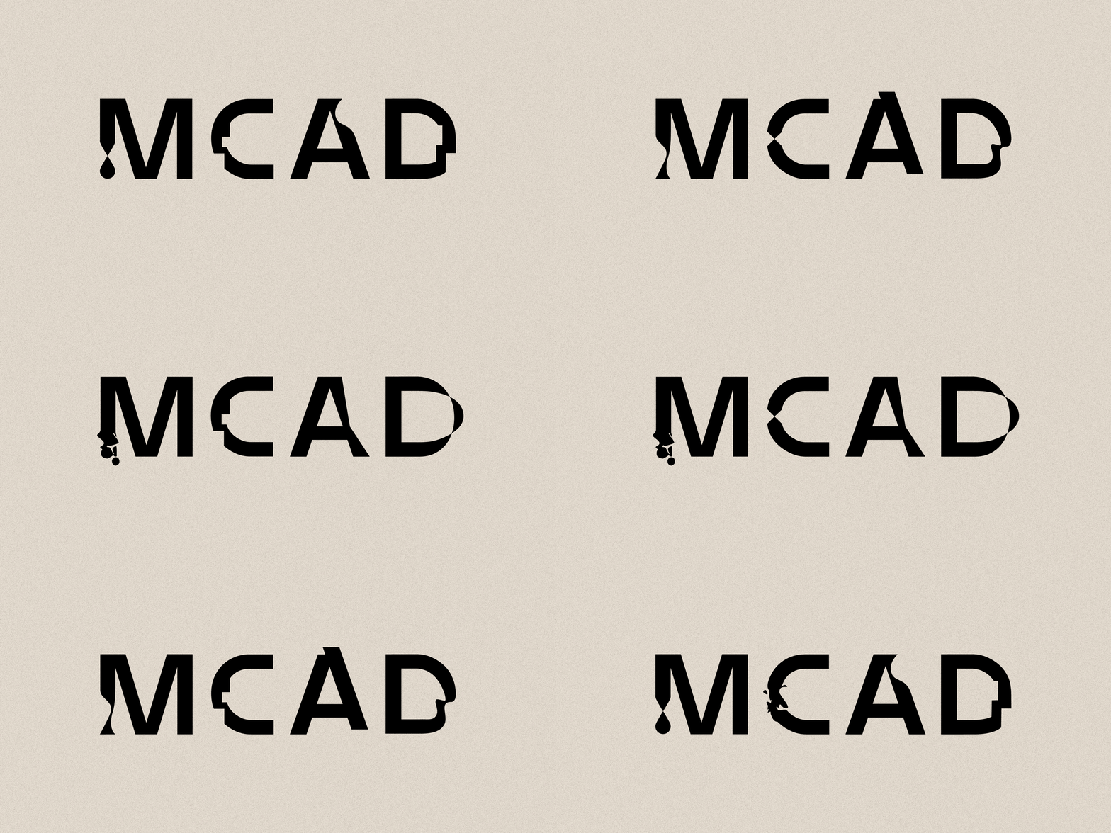


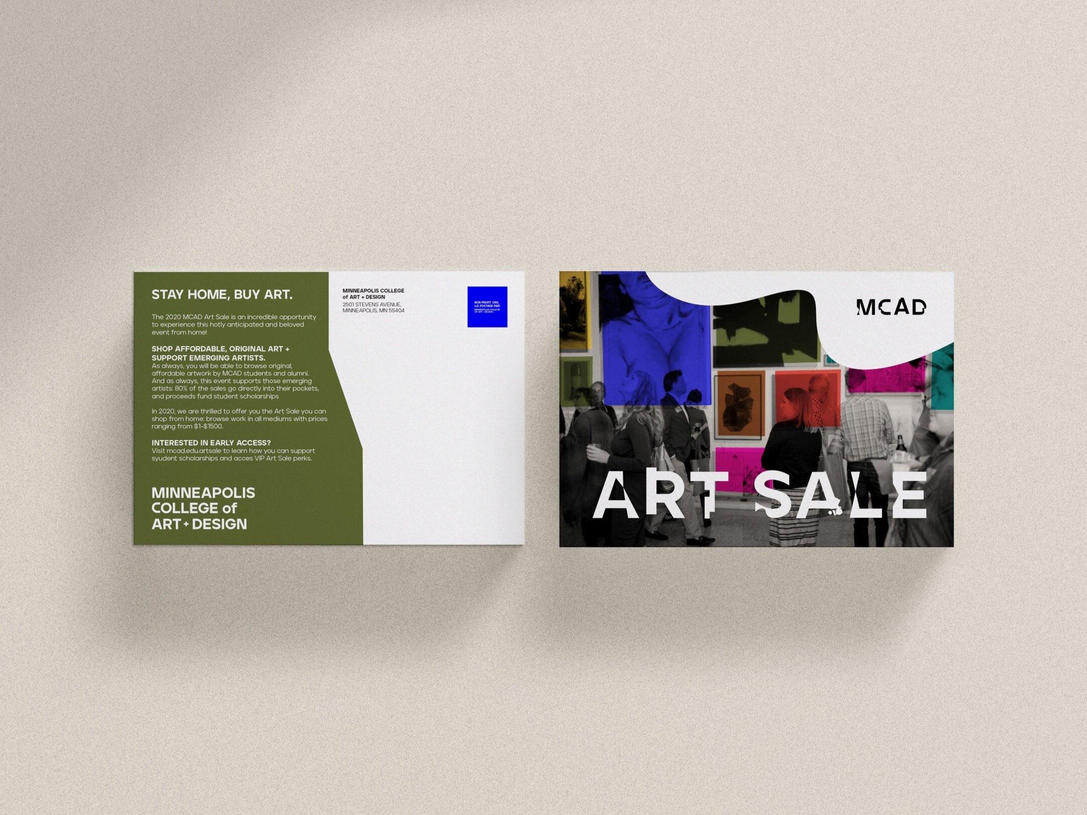
MCAD's rebrand asked the question: how do you visually capture a school that's always shifting, evolving, shaped by the people and environment around it? My concept answered with a toolkit built to evolve right alongside it—colors that layered over each other to form entirely new combinations, and a custom typeface where each letter changed shape as you typed, doubling as a framing device for imagery. The idea was to make transformation not just the message, but the mechanism.
The direction placed second among a group of MCAD alumni contributors. I stayed on through the final stretch—leading typography treatment for the winning concept, and storyboarding and overseeing the launch video from concept to final cut.




FINAL BRAND LAUNCH VIDEOBrand Design
Concept Second Place Finalist 2021
-
Agency: Knock, Inc.
Client: Minneapolis College of Art + Design
KNOCK Team:
Creative Lead: Todd Paulson, MCAD Board of Trustee and Chief Creative Officer & Partner at KNOCK
Account / Strategy / Voice: Diana Ross-Gotta, Jen Klise, and Gene Valek
Final Brand Design: Angela VogtMCAD Team:
Sanjit Sethi, President; Annie Gillette Cleveland, VP, Communications & Marketing Strategy; Kayla Campbell, DesignWorks Manager; and many other board members, staff, faculty, and students.